In today’s digital age, users access websites and web applications from a wide variety of devices with different screen sizes and resolutions. Ensuring that your website or app delivers a seamless and optimized user experience across all these devices is crucial. This is where responsive design comes into play. Responsive design is a web design approach that ensures your site adapts to the user’s device, providing an optimal viewing experience. This blog will explore the best practices for implementing responsive design effectively.
Understanding Responsive Design
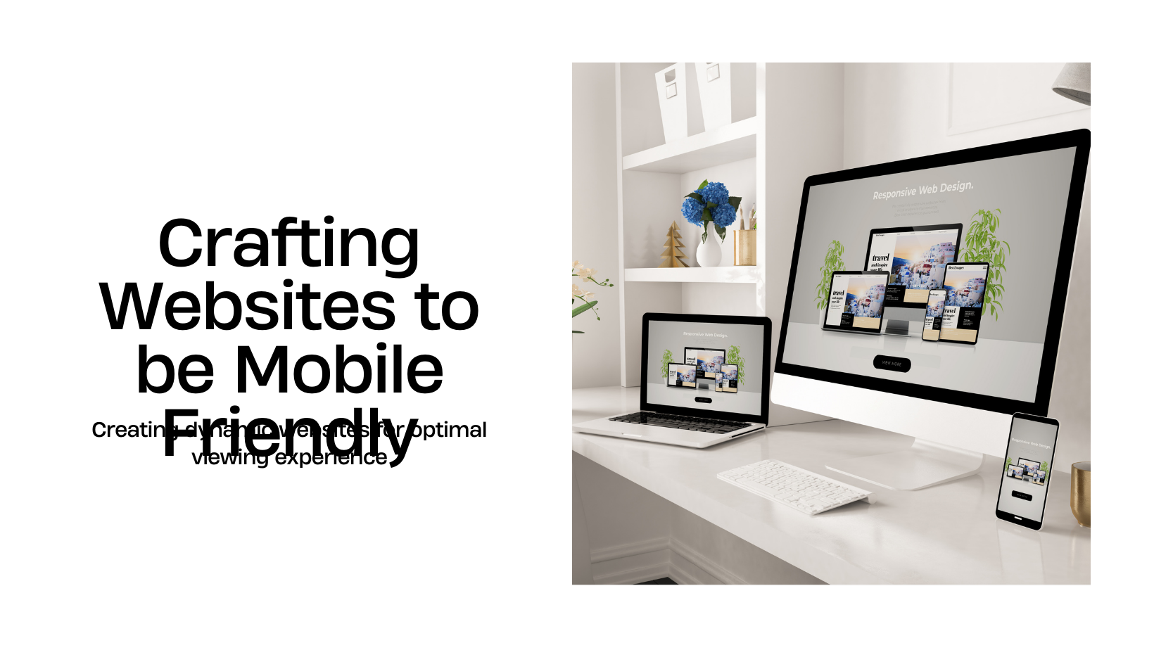
Responsive design involves creating web pages that detect the visitor’s screen size and orientation and change the layout accordingly. It eliminates the need for different designs and development phases for each new gadget on the market. The key components of responsive design include flexible grids, flexible images, and media queries.
Why Responsive Design Matters
- Improved User Experience: A responsive design ensures that users have a consistent and positive experience regardless of the device they use. This can lead to higher engagement and satisfaction.
- Increased Mobile Traffic: With the growing number of mobile users, having a mobile-friendly design is essential. Responsive design caters to this need effectively.
- Cost-Effective: Maintaining one responsive site is more cost-effective than creating and maintaining multiple versions of a site for different devices.
- SEO Benefits: Search engines like Google prioritize mobile-friendly websites in their rankings. A responsive design can improve your site’s visibility in search engine results.
Best Practices for Responsive Design
1. Adopt a Mobile-First Approach
Starting with a mobile-first design strategy means designing for the smallest screen size first and then scaling up. This approach ensures that your site performs well on mobile devices, which is critical given the high volume of mobile traffic.
Benefits of Mobile-First Design:
- Performance: Mobile-first designs are typically faster and more lightweight.
- Focus: Encourages a focus on essential content and functionality.
- Scalability: Easier to scale up for larger screens than to scale down for smaller ones.
2. Use Fluid Grid Layouts
Fluid grids are essential for responsive design. Unlike fixed grids, fluid grids use percentages for widths rather than fixed pixel values, allowing layouts to resize proportionally.
How to Implement Fluid Grids:
- CSS Grid Layout: Utilize CSS Grid Layout to create complex and responsive grid structures.
- Flexbox: Use Flexbox for flexible and responsive layouts that adapt to different screen sizes.
- Percentage-Based Widths: Apply percentage-based widths to layout elements to ensure they scale fluidly.
3. Implement Flexible Images and Media
Ensuring that images and media scale appropriately with different screen sizes is crucial for a responsive design.
Techniques for Flexible Media:
- Max-Width Property: Use the
max-width: 100%;CSS rule to make images scale within their containing elements. - CSS Media Queries: Apply different styles to images and videos based on screen size using media queries.
- SVGs: Utilize Scalable Vector Graphics (SVGs) for images, as they scale without losing quality.
4. Utilize Media Queries Effectively
Media queries allow you to apply different styles based on the characteristics of the device, such as width, height, orientation, and resolution.
Best Practices for Media Queries:
- Breakpoints: Define breakpoints based on content rather than specific devices. Common breakpoints include 320px, 480px, 768px, and 1024px.
- Min-Width and Max-Width: Use
min-widthandmax-widthqueries to create a range of styles for different screen sizes. - Mobile-First Queries: Start with styles for mobile devices and add media queries for larger screens.
5. Prioritize Touchscreen Considerations
With the prevalence of touchscreen devices, designing for touch interactions is essential.
Touchscreen Design Tips:
- Touch-Friendly Elements: Ensure buttons and interactive elements are large enough for touch interactions (at least 44×44 pixels).
- Spacing: Provide adequate spacing between touch targets to prevent accidental clicks.
- Gestures: Support common gestures like swiping and pinching where applicable.
6. Optimize Typography for Readability
Typography plays a significant role in responsive design. Ensure that text is readable on all devices by adjusting font sizes, line heights, and spacing.
Responsive Typography Techniques:
- Relative Units: Use relative units like
emorreminstead of pixels for font sizes to ensure scalability. - Viewport Units: Utilize viewport units (
vwandvh) to scale text relative to the viewport size. - Line Length: Maintain an optimal line length (50-75 characters per line) for readability.
7. Ensure Fast Loading Times
Performance is a critical aspect of responsive design. Slow-loading sites can lead to high bounce rates and poor user experience.
Performance Optimization Tips:
- Image Optimization: Compress and resize images to reduce load times.
- Lazy Loading: Implement lazy loading for images and media to load them only when they come into the viewport.
- Minify CSS and JavaScript: Minify and combine CSS and JavaScript files to reduce the number of HTTP requests.
8. Test on Real Devices
Testing your responsive design on real devices is crucial to ensure it performs well across different screen sizes and orientations.
Testing Strategies:
- Device Labs: Set up a device lab with a variety of devices for testing.
- Emulators and Simulators: Use emulators and simulators to test on devices you don’t have access to.
- Cross-Browser Testing: Ensure your design works seamlessly across different browsers.
Tools and Frameworks for Responsive Design
Several tools and frameworks can help streamline the responsive design process:
- Bootstrap: A popular CSS framework that includes responsive grid systems, components, and utilities.
- Foundation: A responsive front-end framework that provides a flexible grid system and a range of UI components.
- Media Query Inspector: Browser extensions and tools that help visualize and test media queries.
- Responsive Design Mode: Built-in browser tools like Chrome DevTools and Firefox Responsive Design Mode for testing responsive layouts.
Conclusion
Responsive design is no longer optional; it’s a necessity in today’s multi-device world. By following these best practices, you can create websites and web applications that deliver exceptional user experiences across all devices. From adopting a mobile-first approach and using fluid grids to optimizing performance and testing on real devices, each step contributes to a seamless and engaging experience for your users.
At Sodio Technologies, we specialize in creating responsive designs that ensure your digital presence is accessible and user-friendly on any device. Contact us today to learn how we can help you implement best practices for responsive design and enhance your user experience.