In the competitive world of web and app development, creating an intuitive user interface (UI) is paramount for success. An intuitive UI ensures that users can easily navigate and interact with your product, leading to a positive user experience (UX) and higher user retention rates. This blog will explore the principles and best practices for designing intuitive user interfaces, supported by examples and actionable tips.
Understanding Intuitive User Interfaces
An intuitive user interface is one that feels natural and easy to use, requiring minimal effort from users to achieve their goals. It anticipates user needs and provides clear, straightforward interactions. Intuitive UIs are user-centric, focusing on simplicity, consistency, and feedback.
Principles of Intuitive UI Design
1. Simplicity
Simplicity is the cornerstone of intuitive UI design. A simple interface reduces cognitive load, making it easier for users to understand and navigate.
Tips for Simplicity:
- Minimalism: Use a clean, uncluttered design with essential elements only.
- Clear Hierarchy: Organize content logically, prioritizing important information.
- Whitespace: Use whitespace effectively to separate elements and create a balanced layout.
2. Consistency
Consistency across the interface ensures that users can predict interactions based on their past experiences with the product.
Tips for Consistency:
- Design Patterns: Use common design patterns and UI elements that users are familiar with.
- Uniform Styles: Maintain consistent styles for buttons, icons, fonts, and colors.
- Interaction Consistency: Ensure similar interactions produce similar outcomes across the interface.
3. Feedback
Providing feedback helps users understand the results of their actions and guides them through the interface.
Tips for Feedback:
- Visual Cues: Use animations, color changes, and icons to indicate actions.
- Messages: Provide clear and concise messages for errors, successes, and loading states.
- Interactive Elements: Ensure buttons and links provide visual feedback on hover and click.
4. Affordance
Affordance refers to the property of an object that indicates how it should be used. In UI design, it means making elements look interactive and functional.
Tips for Affordance:
- Button Design: Design buttons to look clickable with shadows, borders, and color contrasts.
- Icons: Use familiar icons that clearly represent their functions.
- Gestures: For mobile interfaces, ensure gestures like swiping and tapping are intuitive and consistent.
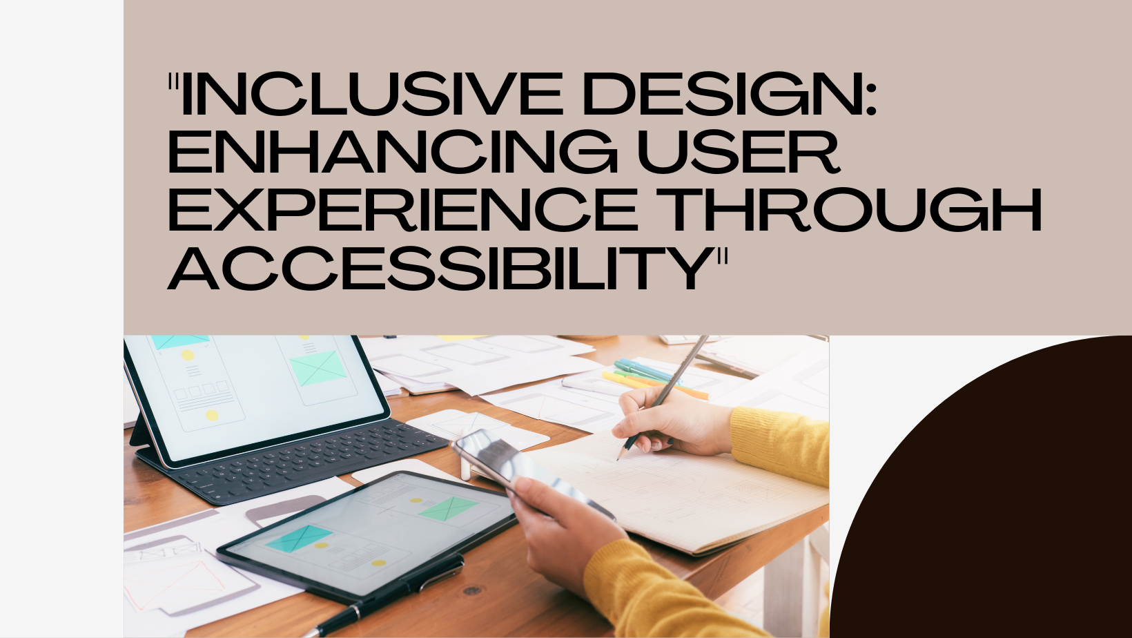
5. Accessibility
An intuitive UI should be accessible to all users, including those with disabilities. Designing with accessibility in mind ensures a wider audience can use your product effectively.
Tips for Accessibility:
- Alt Text: Provide descriptive alt text for images.
- Keyboard Navigation: Ensure all interactive elements are accessible via keyboard.
- Color Contrast: Use high color contrast for text and interactive elements.
- ARIA Labels: Implement ARIA (Accessible Rich Internet Applications) labels for better screen reader compatibility.
Best Practices for Creating Intuitive User Interfaces
1. User-Centered Design
User-centered design (UCD) involves designing with the end-user in mind at every stage of the process. This approach ensures that the final product meets the users’ needs and expectations.
Steps for UCD:
- User Research: Conduct surveys, interviews, and usability testing to understand user needs and behaviors.
- Personas: Create user personas representing different segments of your target audience.
- User Journeys: Map out user journeys to visualize how users interact with your product.
2. Prototyping and Testing
Prototyping and testing are crucial for refining the UI design. Prototypes allow designers to test interactions and gather feedback before final implementation.
Tips for Prototyping and Testing:
- Low-Fidelity Prototypes: Start with sketches and wireframes to outline the basic structure and flow.
- High-Fidelity Prototypes: Create interactive prototypes with detailed designs and interactions.
- Usability Testing: Conduct usability tests with real users to identify pain points and areas for improvement.
3. Clear Navigation
Navigation is a key component of an intuitive UI. Clear and intuitive navigation ensures users can find what they need quickly and easily.
Tips for Clear Navigation:
- Navigation Bar: Use a fixed navigation bar with clearly labeled links.
- Breadcrumbs: Implement breadcrumbs to help users understand their location within the site.
- Search Functionality: Include a search bar with autocomplete suggestions for easier navigation.
4. Visual Hierarchy
Visual hierarchy guides users’ attention to important elements first, helping them understand the interface quickly.
Tips for Visual Hierarchy:
- Size and Weight: Use larger and bolder fonts for headings and important elements.
- Color and Contrast: Use color and contrast to highlight key actions and information.
- Alignment: Align elements consistently to create a structured layout.
5. Microinteractions
Microinteractions are small, subtle interactions that enhance the user experience. They provide feedback and improve the overall usability of the interface.
Examples of Microinteractions:
- Button Animations: Add animations to buttons on hover and click.
- Loading Indicators: Use loading spinners or progress bars to indicate ongoing processes.
- Confirmation Messages: Display confirmation messages after user actions, such as form submissions.
Case Studies: Intuitive UI Design in Action
1. Airbnb
Airbnb’s UI is a prime example of intuitive design. The interface is clean and simple, with a focus on high-quality images and clear navigation. The search functionality is robust, with filters and autocomplete suggestions that make finding accommodations easy. Feedback is provided through subtle animations and clear messaging, enhancing the overall user experience.
2. Spotify
Spotify’s interface is designed for ease of use and accessibility. The navigation is straightforward, with a fixed sidebar for easy access to playlists and recently played songs. The use of familiar icons and consistent design patterns ensures users can navigate the app intuitively. Microinteractions, such as animations when adding songs to a playlist, provide instant feedback and improve usability.
3. Google Maps
Google Maps excels in providing an intuitive user experience through clear visual hierarchy and responsive interactions. The interface adapts to different screen sizes and orientations, ensuring a seamless experience across devices. The use of breadcrumbs, clear labels, and interactive elements makes navigation effortless. Real-time feedback, such as route suggestions and traffic updates, keeps users informed and engaged.
Tools for Creating Intuitive User Interfaces
Several tools can aid in designing intuitive user interfaces:
- Sketch: A vector-based design tool for creating high-fidelity prototypes.
- Figma: A collaborative design tool that allows real-time collaboration and prototyping.
- Adobe XD: A design tool for creating wireframes, prototypes, and animations.
- InVision: A prototyping tool with features for user testing and feedback.
- Axure RP: A powerful tool for creating interactive prototypes and wireframes.
Conclusion
Creating an intuitive user interface is essential for providing a positive user experience and achieving business success. By adhering to principles of simplicity, consistency, feedback, affordance, and accessibility, designers can create UIs that are easy to use and navigate. Implementing best practices such as user-centered design, prototyping and testing, clear navigation, visual hierarchy, and microinteractions further enhances the intuitiveness of the interface.
At Sodio Technologies, we specialize in designing intuitive user interfaces that meet the needs of your users and drive engagement. Contact us today to learn how we can help you create a user-friendly and intuitive interface for your digital products.