

How to Develop Reusable Components with Angular.js
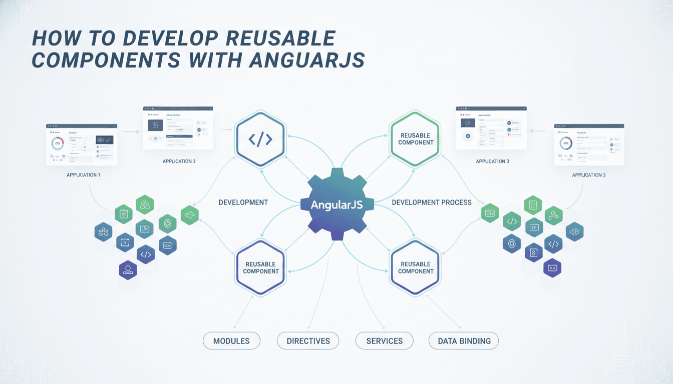
Angular's component architecture is one of its strongest features, but most teams use only a fraction of what it offers. This post covers the practical patterns for building components that you can actually reuse across projects, not just across pages.
What Makes a Component Genuinely Reusable?
Reusability is not about writing generic code. It is about drawing the right boundary between what a component owns and what it delegates to its caller.
A component that fetches its own data, manages its own styles, and makes assumptions about its parent's structure will break the moment you move it. A truly reusable component does one thing, accepts inputs clearly, emits outputs predictably, and does not reach outside its own template.
The test is straightforward: can you drop this component into a different Angular workspace with no changes other than importing it? If the answer is no, find the dependency that is causing the coupling and remove it.
Input and Output contracts
Every reusable component should have an explicit, typed interface. Use @Input() with typed properties rather than any. Use @Output() with EventEmitter<T> where T is a specific interface, not a generic object.
@Input() config: TableConfig;
@Output() rowSelected = new EventEmitter<TableRow>();
If a property is optional, give it a default. If it is required, enforce it with Angular's input.required() signal API (available from Angular 17 onwards) or at minimum document it clearly so the next engineer does not have to read the implementation to use the component.
Content projection with ng-content
ng-content lets callers inject arbitrary markup into a fixed slot in your component. This is the mechanism you want when the component controls layout but not content.
Use select attributes to define named slots:
<ng-content select="[header]"></ng-content>
<ng-content select="[body]"></ng-content>
<ng-content select="[footer]"></ng-content>
This keeps the host component free of assumptions about what goes inside, while still enforcing structure.
How Do You Organise a Shared Component Library in Angular?
The standard answer is an Angular library inside an Nx monorepo. The structure that tends to work well in practice:
libs/
  ui/
    src/
      lib/
        button/
        table/
        modal/
      index.ts   ← public API surface
The index.ts file is important. Only export what callers need. Keep implementation details internal. If you expose everything, you will find yourself afraid to refactor because you do not know what is being used externally.
For teams not on Nx, Angular's built-in ng generate library creates a comparable structure inside a multi-project workspace. The trade-off is that Nx gives you dependency graph tooling and affected-build detection, which matter once the library count grows past five or six.
| Approach | Best for | Main trade-off |
|---|---|---|
| Nx monorepo with libs | Multiple apps, multiple teams | Initial setup overhead |
| Angular multi-project workspace | One app, one shared lib | Limited tooling for larger graphs |
| Separate npm package | Cross-organisation sharing | Versioning and publish overhead |
Versioning and breaking changes
Semantic versioning applies here even for internal libraries. A change to an @Input() type is a breaking change. Treat it like one. If you are publishing internally via a private npm registry or Nx Cloud, increment the major version and give consuming teams a migration path.
Angular's ng update schematics are worth writing for any library that sees significant breaking changes. They take time to write but eliminate a category of manual migration errors.
/// Not sure where to start?
Get the architecture before you commit
Tell us what you're building and we'll map the technical approach, stack, and rough timeline. No cost, no obligation, no sales call required.
What Is the Right Way to Handle Styling in Shared Components?
This is where most library projects go wrong. Component styles written with fixed colour values, hardcoded pixel sizes, or assumptions about the host app's typography will conflict with the consuming application.
Use CSS custom properties (variables) for anything a caller might want to override:
:host {
  --button-bg: #0057ff;
  --button-radius: 4px;
}
The caller can then override these at whatever specificity they need without touching the component's internal styles.
Angular's ViewEncapsulation.Emulated (the default) is fine for most cases. Avoid ViewEncapsulation.None in a library; it leaks styles globally and causes conflicts that are difficult to trace. ViewEncapsulation.ShadowDom gives true isolation but breaks some patterns around CSS variables in older browsers and complicates theming.
Design tokens fed through CSS variables, rather than SCSS variables, are the safer choice. SCSS variables resolve at compile time; CSS variables resolve at runtime, which means a host application can switch themes without rebuilding the library.
Change Detection and Performance in Reusable Components
Reusable components are used many times, often inside lists or complex trees. The default ChangeDetectionStrategy.Default will trigger checks on every cycle across every instance. Switch to ChangeDetectionStrategy.OnPush in every shared component.
@Component({
  changeDetection: ChangeDetectionStrategy.OnPush,
})
With OnPush, Angular only checks the component when an @Input() reference changes, an @Output() event fires, an async pipe resolves, or you call markForCheck() explicitly. This cuts unnecessary rendering cycles significantly in large trees.
If you are on Angular 17 or later, signals provide a more granular reactivity model. A signal()-based input updates only the parts of the template that depend on it, rather than triggering a full component check. Worth adopting for new libraries; the API is stable in Angular 17 and the migration from @Input() to input() is mechanical.
Testing reusable components
A reusable component should have its own unit tests that make no assumption about a host application. Use TestBed with the component in isolation. Test @Input() bindings directly. Emit events and assert that @Output() fires with the correct payload.
For visual components, Storybook (v7 or v8) with the @storybook/angular builder is the practical choice for documentation and visual regression. Each story documents a valid state of the component. Chromatic or Percy can run visual diffs on those stories in CI.
Structuring the Public API to Avoid Breaking Changes
The public API of a component library is everything exported from index.ts. Once something is exported, callers depend on it. Structure exports with that in mind.
Export interfaces and types alongside components. If a caller needs to construct a TableConfig object to pass as an @Input(), they need the type. Do not make them reconstruct it by reading your source.
Use Angular's exportAs sparingly. It is useful for things like exposing a reset() method on a form component, but it creates a surface that is easy to misuse and hard to deprecate.
Deprecation should happen in the JSDoc before the removal. Angular's own API surface uses @deprecated comments with a version note and a replacement hint. Copy that pattern.
Conclusion
The difference between a component that gets reused and one that gets copy-pasted is mostly about contracts. Clear typed inputs, predictable outputs, no hidden dependencies, and styles that do not leak.
Start with one well-specified component. Get the index.ts export surface right, add Storybook stories, and write the unit tests before you scale. Once you have that pattern working, adding more components to the library is straightforward.
If you are starting a new Angular project and want to set up a shared library architecture correctly from day one, talk to the team at Sodio. We have built Angular component systems for fintech, edtech, and enterprise dashboards and can help you avoid the structural decisions that are expensive to undo later.
FAQ
What is the minimum Angular version for building a reusable component library?
Angular 14 introduced standalone components, which significantly simplify library development by removing the need for NgModule declarations. Angular 17 added stable signal APIs. Either is viable for a new library, but 17 gives you better reactive primitives and the input.required() enforcement that older versions lack.
Should shared components manage their own state? Generally no. A shared component should be a presentation layer that receives data and emits events. State management belongs in a service or in the host application's store. The exception is internal UI state, such as whether a dropdown is open, which is not meaningful outside the component itself.
How do you handle translations or i18n in a shared component library?
Do not bundle translation strings inside the component. Expose text as @Input() properties or use Angular's @angular/localize package and let the consuming application provide the translation pipeline. Bundling strings creates a tight coupling between the library's release cycle and the application's language requirements.
When should you publish a component as an npm package versus keeping it in a monorepo? Publish to npm when the component is used by teams working in separate repositories. Keep it in a monorepo when all consumers are in the same repo. The npm route adds a versioning and publish step; the monorepo route gives you atomic refactors across the entire codebase at the cost of a larger repository.
How do you prevent consumers from using internal component APIs?
Control the index.ts barrel file strictly. Only export what is part of the public contract. For Angular libraries built with ng-packagr, anything not exported from the public API entry point is tree-shaken and effectively inaccessible. Code review on index.ts changes is a lightweight governance mechanism that works well in practice.
Have a project in mind? Contact Sodio Technologies to discuss your requirements and explore the right technology solution for your business.
/// Work with us
Talk to the engineers who'd build it
You'll get a technical scope, timeline and cost estimate from the people doing the work, not an account manager. In-house team, no subcontracting, since 2016.