

How to Develop Reusable Components with React.js
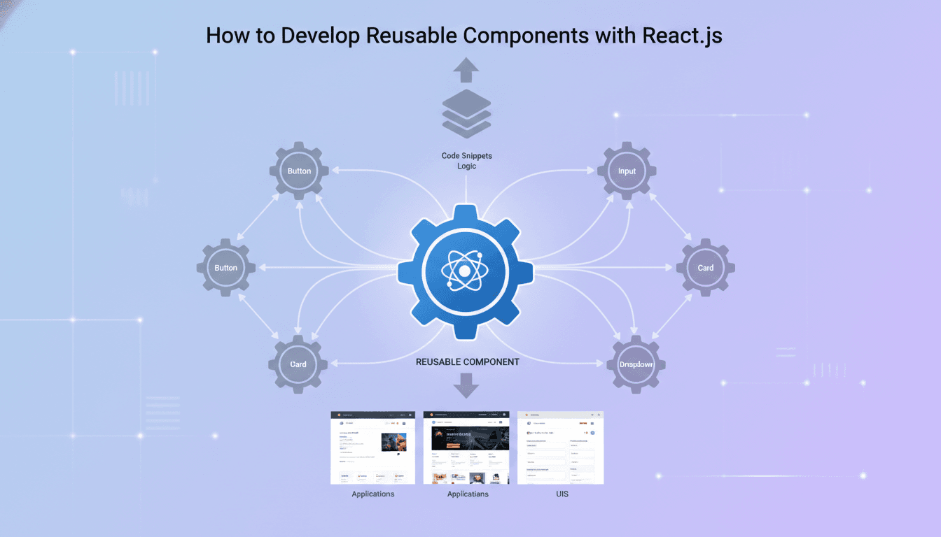
Reusable components are the difference between a React codebase that scales and one that turns into a maintenance burden six months after launch. This post walks through the practical patterns — props design, composition, abstraction boundaries — that make components actually reusable rather than just copy-pasted.
Why Most Components End Up Not Being Reused
The instinct when building quickly is to write a component that solves the immediate problem. It works for the one screen it was built for. Then a second screen needs something similar, and a developer either copies the first component and tweaks it, or adds a prop called isSpecialCase and branches inside the render. Repeat this a dozen times and you have a codebase full of near-duplicates and conditionals that nobody wants to touch.
The root cause is almost always that the component was designed around a specific use case rather than a behaviour. A UserCard that hard-codes avatar size, action buttons and background colour is not a component — it is a screenshot. A Card that accepts layout, content and action slots as props is a component.
The fix is not to anticipate every future use case at design time. That leads to over-engineered abstractions that are just as hard to work with. The fix is to identify the stable interface early: what varies, what stays constant, and where the boundary between the two sits.
What Does a Good Props API Actually Look Like?
Props design is API design. The same principles apply: small surface area, explicit contracts, no hidden state.
Keep props declarative, not imperative
A prop called onSubmit that receives a function is declarative. A prop called submitNow that is a boolean trigger is imperative and forces the parent to manage timing. Declarative props compose cleanly. Imperative props leak implementation details.
Use TypeScript interfaces to enforce contracts
TypeScript with React 18 gives you strict prop typing out of the box when you define component props as an interface rather than an inline type. Use React.FC<Props> sparingly — the explicit return type annotation on a regular function gives you more control and avoids the implicit children prop that React.FC used to include before React 18 removed it.
interface ButtonProps {
  label: string;
  variant: 'primary' | 'secondary' | 'ghost';
  onClick: () => void;
  disabled?: boolean;
  icon?: React.ReactNode;
}
Five props. Two optional. No any. This is the kind of interface a new engineer can read in thirty seconds and understand completely.
Avoid boolean explosion
When a component accumulates props like isLarge, isDark, isOutlined, isFullWidth, it is signalling that it is trying to be several components at once. Consolidate with a variant or size enum. If the variants are genuinely unrelated, split into separate components.
How Do You Structure a Component Library That Teams Actually Use?
The component that no one imports is not reusable in any meaningful sense. Structure matters as much as implementation.
Co-locate stories and tests with the component
A component folder should contain the component file, its types, its Storybook story and its test file. When everything lives together, the cost of updating one is low enough that developers actually do it.
/Button
  Button.tsx
  Button.types.ts
  Button.stories.tsx
  Button.test.tsx
  index.ts
The index.ts re-exports the component and its types. Nothing outside this folder imports from Button.tsx directly.
Use Storybook 7+ as your source of truth
Storybook's args pattern combined with @storybook/testing-library lets you write interaction tests that run both inside Storybook and in your Jest suite. This is not a nice-to-have. It is the mechanism that keeps a component's documented behaviour and its actual behaviour in sync.
Establish a versioning strategy before you have more than one consumer
If your component library is consumed by two or more applications, semantic versioning matters immediately. Patch for bug fixes, minor for new props with backward-compatible defaults, major for breaking interface changes. Publish to a private npm registry (GitHub Packages or a self-hosted Verdaccio instance) rather than sharing via a monorepo symlink — the latter hides the real cost of breaking changes.
/// Not sure where to start?
Get the architecture before you commit
Tell us what you're building and we'll map the technical approach, stack, and rough timeline. No cost, no obligation, no sales call required.
Composition Patterns That Hold Up Under Real Conditions
Compound components
The compound component pattern uses React context to share state between a parent and its children without prop drilling. A Tabs component built this way exposes Tabs, Tabs.List, Tabs.Tab and Tabs.Panel. The parent manages active state internally; each child reads from context.
This pattern works well when the sub-components always appear together and the relationship between them is meaningful. It works poorly when consumers want to render the sub-components in radically different DOM structures — at that point, the context assumptions break down.
Render props vs. custom hooks
Render props gave React a composition mechanism before hooks existed. Custom hooks are almost always the cleaner choice now. If you find yourself writing a render prop, ask whether a hook returning the same state would serve the consumer better. The answer is yes roughly 90% of the time.
The exception is when the component needs to control rendering — a virtualised list, for example, where the component owns the DOM structure and the consumer supplies only the row renderer.
Controlled vs. uncontrolled components
This trade-off applies beyond form inputs. Any component with internal state should decide early whether it is controlled (state lives in the parent, component receives value and onChange), uncontrolled (state lives inside the component, parent can read via ref), or hybrid (default uncontrolled, optionally controlled when the parent provides value).
The hybrid pattern — sometimes called "uncontrolled with controllable override" — is the most flexible and the most complex. React's own useControllableState pattern from the Radix UI primitives codebase is a clean reference implementation.
| Pattern | State ownership | Good for |
|---|---|---|
| Controlled | Parent | Forms, wizards, anything needing external sync |
| Uncontrolled | Component | Dropdowns, tooltips, disclosures |
| Hybrid | Either | General-purpose library components |
Performance Considerations You Cannot Ignore at Scale
React.memo prevents re-renders when props are shallow-equal. Use it on leaf components that are expensive to render or that appear many times in a list. Do not wrap every component in memo by default — the comparison itself has a cost, and for cheap components it is not worth paying.
useMemo and useCallback inside a component follow the same logic. They are not free. Profile with React DevTools Profiler before adding them, not after.
For large component libraries, tree shaking depends on how you export. Named exports from an index.ts barrel file are tree-shaken correctly by Webpack 5 and Vite with sideEffects: false in your package.json. Default exports from barrel files are often not. This is a common source of unexpectedly large bundles.
Conclusion
Reusable components are built incrementally, not designed upfront in their final form. Start with a clear props interface, co-locate documentation and tests, pick a composition pattern that matches the actual use case, and establish a versioning discipline before you have multiple consumers.
The concrete next step: audit one component in your current codebase that has more than four boolean props. Refactor its interface to use a variant enum, write a Storybook story for each variant, and measure whether the resulting API is easier to explain to a new team member. That exercise will teach you more about reusability than any design system guide.
FAQ
What is the difference between a reusable component and a generic component? A reusable component solves a real, recurring problem with a stable interface. A generic component tries to solve all problems and typically ends up solving none well. Aim for reusable first — if the same component genuinely covers five unrelated use cases without branching, then it has earned the label "generic".
Should every project have a component library? Not immediately. A shared component library makes sense once you have two or more applications sharing UI, or a single application large enough that inconsistency between screens is causing bugs. Before that point, a well-organised set of components within the application is sufficient and much cheaper to maintain.
How do you handle breaking changes in a shared component library?
Semantic versioning is the mechanical answer. The harder part is communication. Maintain a changelog, pin consumers to exact versions in CI, and give teams a migration period — typically two minor releases — before removing deprecated props. Codemods written with jscodeshift can automate straightforward migrations.
When should you use a third-party component library instead of building your own? If your design system closely matches an existing library — Radix UI primitives, MUI, Chakra UI — use it. Building a component library from scratch takes longer than most teams estimate, often 3 to 6 months before it is reliable enough for production use. Build only what you cannot get elsewhere, or where the existing options carry unacceptable bundle weight or accessibility gaps.
Does React Server Components change how you think about reusability? Yes, meaningfully. With React Server Components (RSC) in Next.js 13+, components that fetch their own data can live on the server and ship zero client-side JavaScript. A reusable component must now declare whether it is a server component or a client component, because hooks and browser APIs are only available in client components. Designing the boundary between the two is now part of the reusability conversation.
Have a project in mind? Contact Sodio Technologies to discuss your requirements and explore the right technology solution for your business.
/// Work with us
Talk to the engineers who'd build it
You'll get a technical scope, timeline and cost estimate from the people doing the work, not an account manager. In-house team, no subcontracting, since 2016.